Charting
Charting in SQL refers to visualizing data in charts or graphs using SQL queries. Although SQL is primarily used for data manipulation and retrieval, it can also create charts and visualizations. Charting in SQL is commonly used in business intelligence and data analysis applications, where data visualization is an essential component of making informed decisions.
Several SQL-based charting tools, such as Tableau, Power BI, and QlikView, enable users to create charts and graphs from SQL data. These tools typically provide a user-friendly interface for designing charts, selecting data, and applying various formatting options.
To create charts in SQL, you must first retrieve the data using SQL queries. Once you have the data, you can make the chart using charting functions or libraries. SQL supports several charting functions, such as the PIVOT function, which you can use to pivot data and create charts.
For example, to create powerful and informative charts using SQL, follow these general steps:
- Select the data: Use a SELECT statement to choose the data you want to chart.
- Group the data: Use GROUP BY to aggregate the data by a specific column or set of columns.
- Choose a chart type: Choose the chart that best suits your data, such as a bar chart, line graph, or scatterplot.
- Use a charting function: Use a built-in SQL charting function, such as PIVOT or UNPIVOT, to transform the data into a format that can be charted.
- Customize the chart: Add labels, titles, and other visual elements to your chart to make it more informative and readable.
Here’s a SQL query to create a bar chart of the total quantity of products sold by category:
SELECT category, SUM(quantity) as total_quantity
FROM sales
GROUP BY category;
Once you have the data, you can use a charting function like PIVOT to transform the data into a format suitable for a bar chart. Here’s an example:
SELECT category, [Books], [Electronics], [Clothing]
FROM (
 SELECT category, product_type, SUM(quantity) as total_quantity
 FROM sales
 GROUP BY category, product_type
) as sales_pivot
PIVOT (
 SUM(total_quantity)
 FOR product_type IN ([Books], [Electronics], [Clothing])
) as pivoted_sales;
The result is a table with one row for each category and columns for each product type, with the total quantity of products sold in each category. You can use a charting tool to create a bar chart of the data, adding labels, titles, and other visual elements to make the chart more informative and easier to read.
Charting in Coginiti
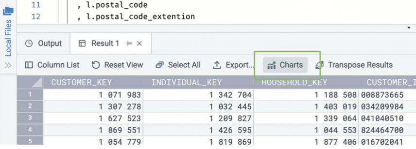
If you are using Coginiti Pro, you can click on the Chart tool to create visual charts based on the data in the Results grid.
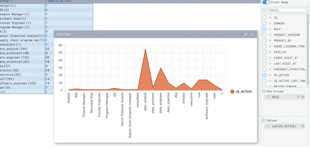
- Choose a result set you want to chart and click the Chart button.

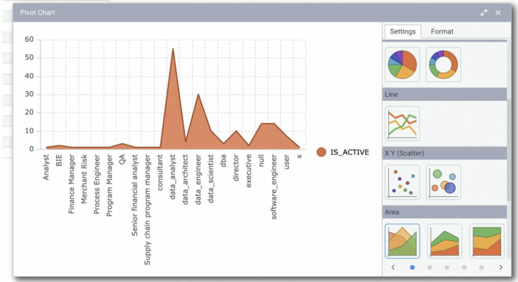
- Select the data you want to chart from the right-side options. Besides, you can choose between a Range chart or Pivot Chart that allows you to explore and analyze in different ways by dragging and dropping the values.
- Different data require different charts, so you can choose the best visualization for your result set.
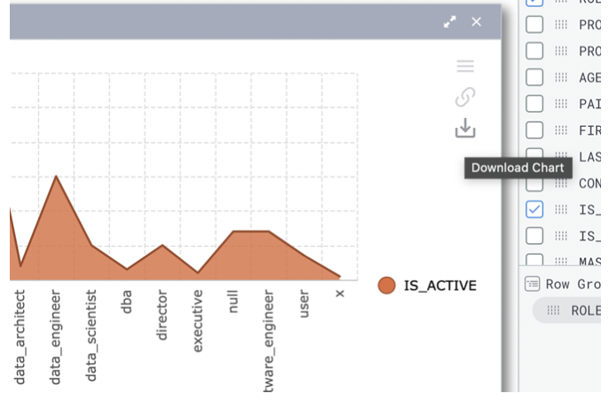
- When finished, download your graphic as a PNG file to add to your presentation.